

At various times in my life, observant strangers have guessed my profession after simply looking at something that I had handwritten. I can tell you of only two professions where this trick is possible. I’ll start with the easy one: If the handwriting appears as scribble and is impossible to read, one might guess that the author is a doctor, too busy be concerned with letter formation. Then there is the architect. So, what are the characteristics that reveal that the author is an architect? What is it that makes an architect’s handwriting different than that of others? Is there truly a connection between architecture and handwriting?

For some reason, which I have been unable to pin down, architects “letter” rather than “write”. I suspect the reason for this semantic difference is simply to give more emphasis to the stroke and form of the actual letters. It is often observed that architects tend to “print” rather than write in “cursive.” This seems to have originated in a time when all architectural drawing and lettering was by hand, and printed block letters are simply easier to read than script letters. Since the architect’s drawings are used to construct buildings, it is important that they be clearly and easily read. Architects also tend write in all capital letters (which has not always considered screaming!), again for legibility. However, the characteristic that most distinguishes architectural lettering is that the letterforms are stylized. Here is a little secret (or maybe it’s not a secret at all): Architectural lettering is not “natural”. It is something that is carefully crafted. A great explanation of this process can be found in Doug Patt’s classic video “How to Write Like an Architect”.
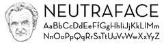
The stylized lettering of architects stands in contrast to our that of our colleagues, the engineers. While engineers strive for consistency and uniformity in both drawings and lettering, architects strive for creativity and individuality within looser constraints. By considering the slant of the strokes, the verticality of the stems, the shape of like characters, the proportions, and the spacing between characters, one can craft an individual lettering “style”. In the days when architects drew and lettered exclusively by hand, one could identify which architects worked on which drawings simply by the way they lettered. Architects developed their own drawing style. Richard Neutra developed a lettering style so well designed and distinctive that it has been picked up by a contemporary font foundry – House Industries. Other architects in this category include Frank Lloyd Wright and Charles Rennie Macintosh. Ironically, this conversion to typefaces makes the lettering created by those architects both consistent and uniform.


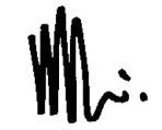
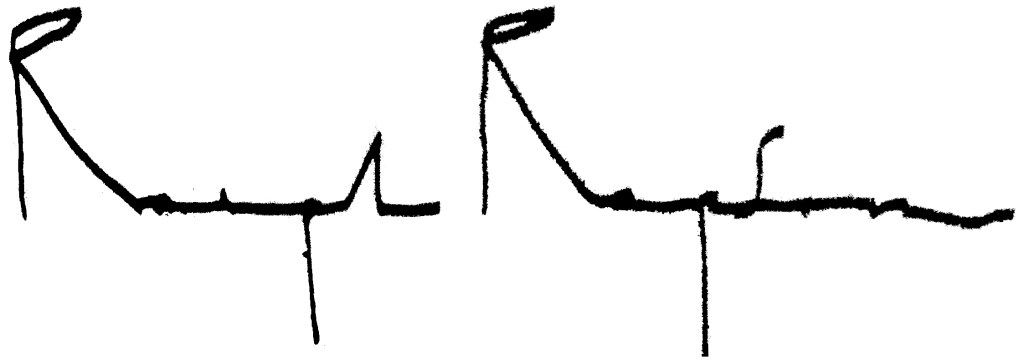
The design consideration that architects put into their lettering carries into other areas as well. Another way that architects reveal their handwriting dexterity is revealed in their signatures. A lot of architects have really cool signatures. Whether the characters are recognizable or not, these signatures are usually carefully crafted designs. Renzo Piano and Ralph Raison are two of my favorites.
Drawings, lettering and signatures are therefore closely connected to the architect’s individual style. The ultimate manifestation of that style takes the form of a building, and no building type is more coveted by the architect than the museum. That’s the next architecture connection we’ll explore. Join me for Art or Architecture.
